Create & configure the carousel
Since this uses Swiper, you can choose to initialize the Swiper instance with HTML & JS using this Swiper starting guide.
But for this example below, we're using the Elementor Carousel Widget. If you're trying to display post data dynamically, like team members or resources, you will want to use the Elementor Loop Carousel.
Regardless of which widget you use, the process and the settings will be similar, just take note that the slides on display setting will vary on how many columns you want. In my example, it's for a 3 column, 2 row layout, which means I need to display 6 slides.
Settings
| Slides on Display | 6 |
| Slides on Scroll | 1 |
| Equal Height | On |
| Autoplay | No |
| Infinite Scroll | No |
| Transition Duration |
500ms |
| Direction |
Left |
| Navigation Arrows |
Show |
| Pagination |
Dots |
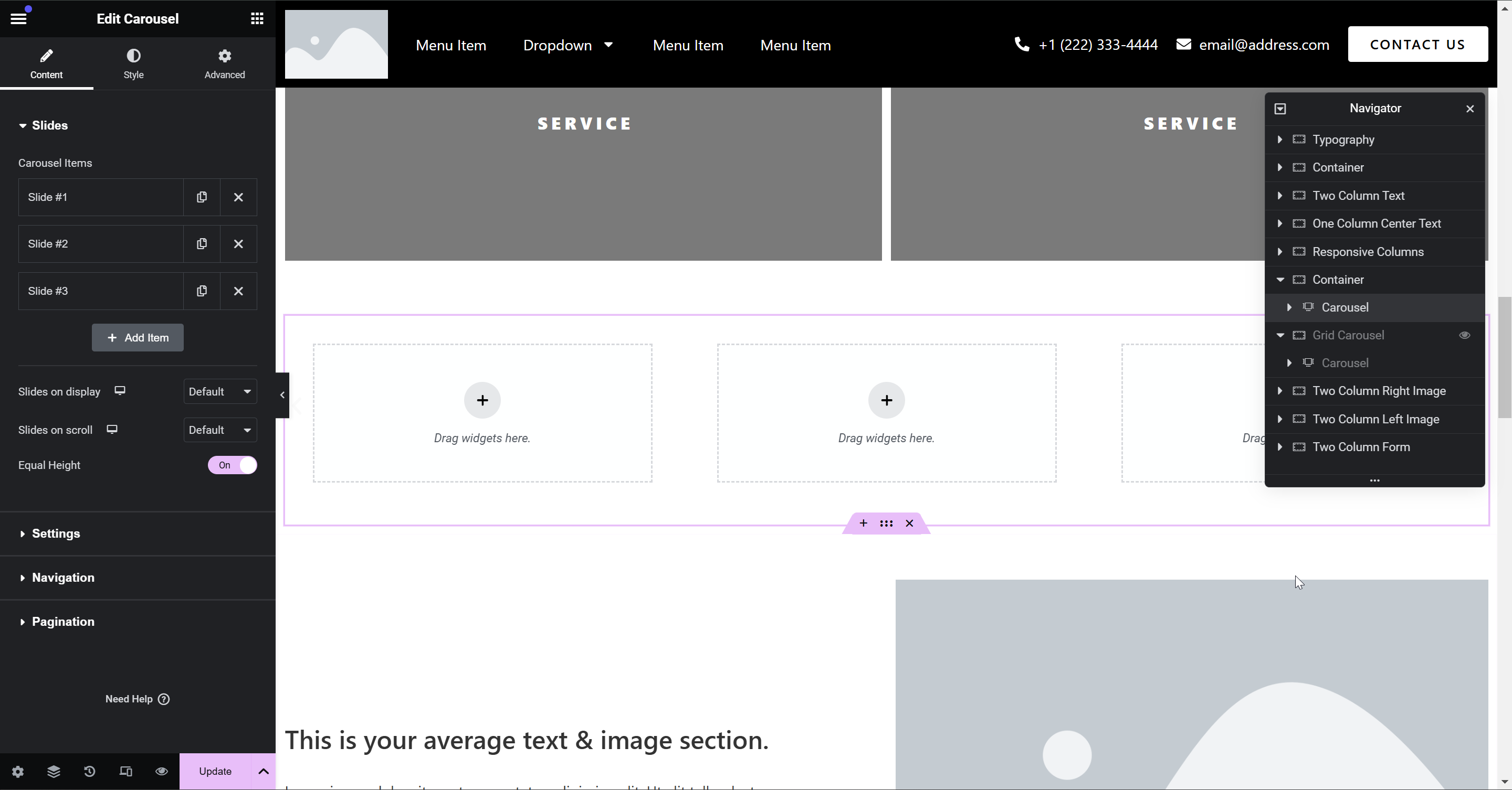
In Elementor, drag in the Carousel widget. Then, configure it to match the above settings.
If you have Nested Elements enabled, it should look something like this by default. Then it's up to you to create your individual carousel style.
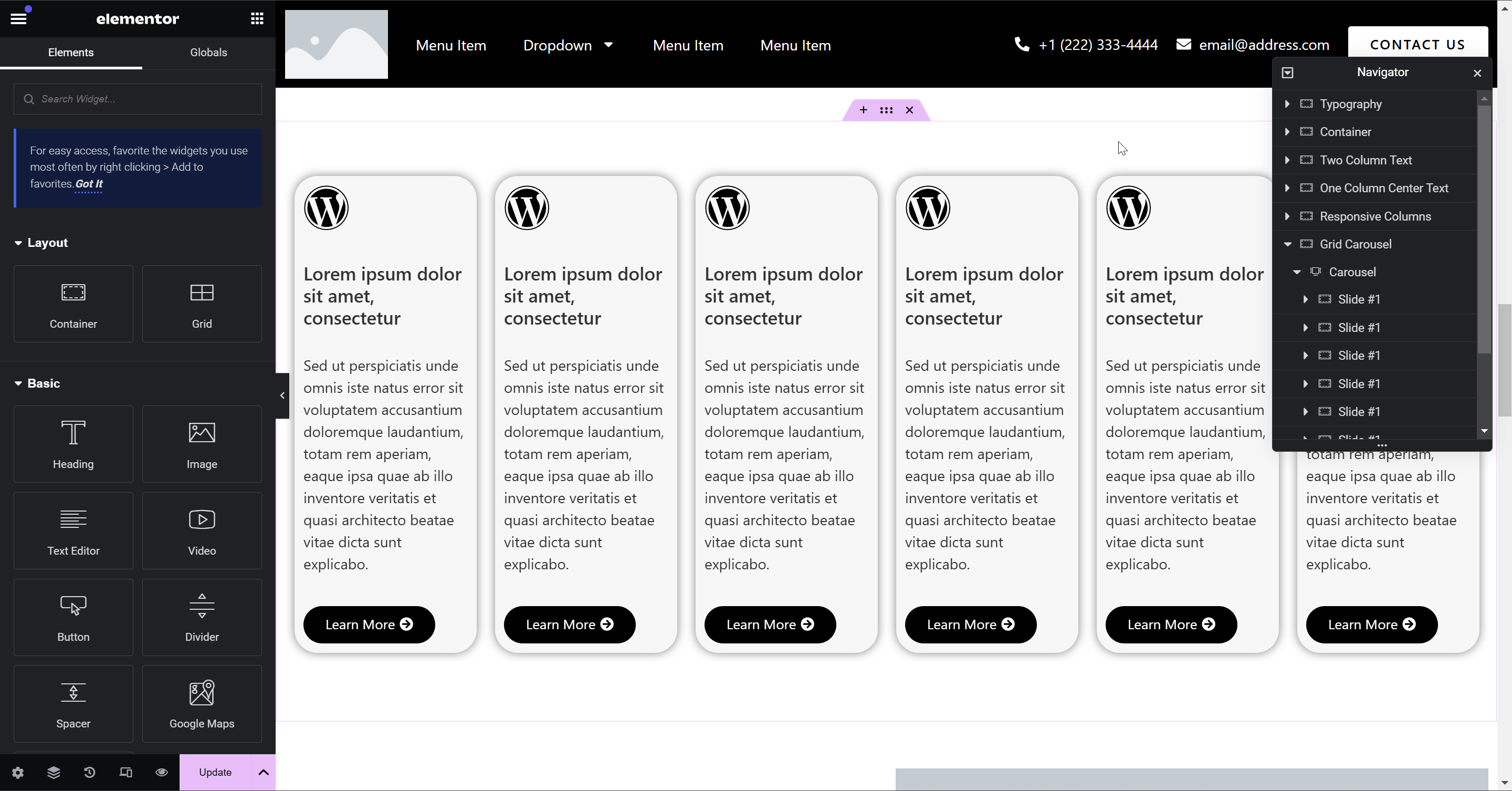
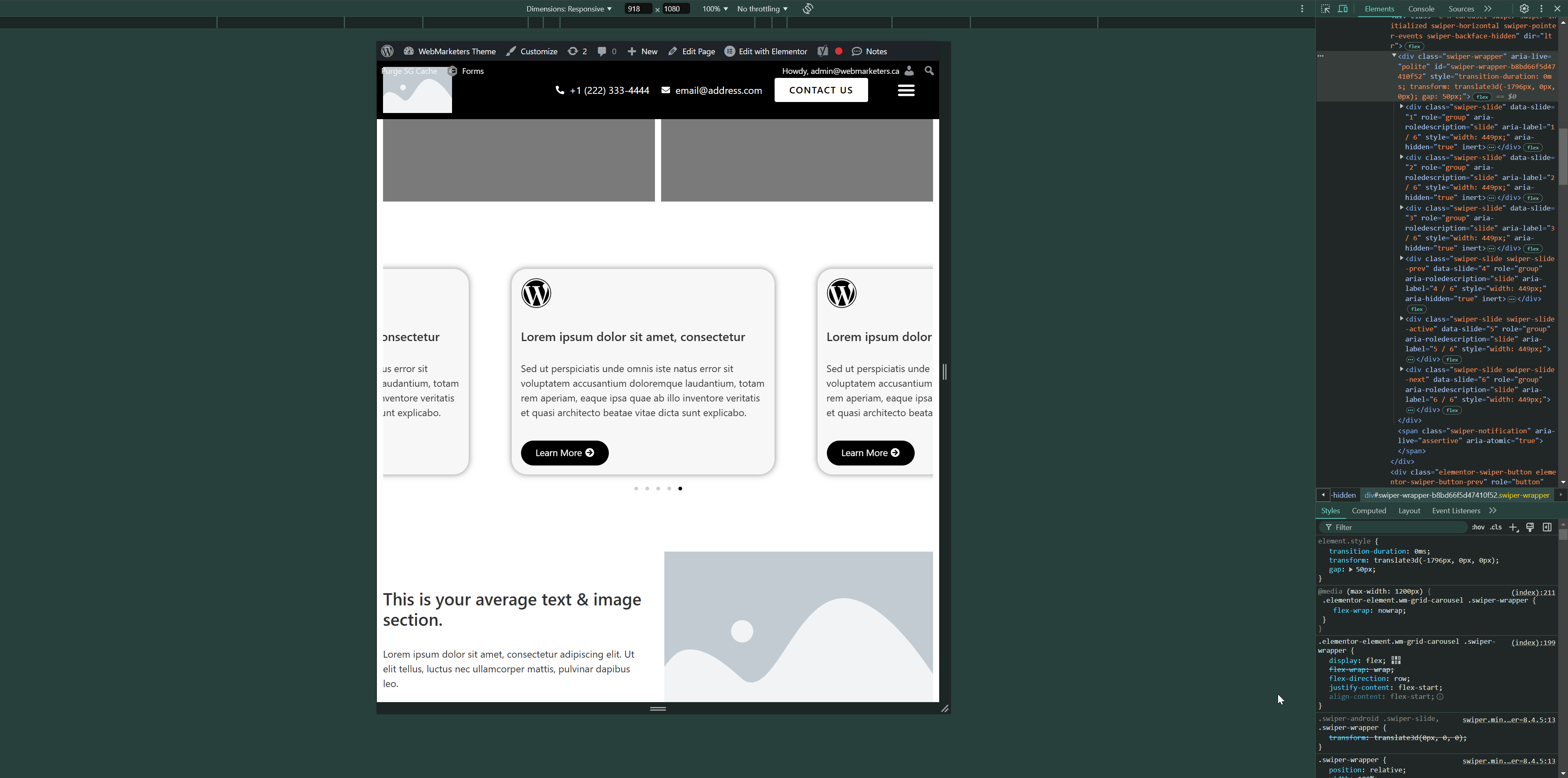
Once you have all the settings toggled and your carousel slide styles have been applied, it should look something like this:
Now this is where the fun begins. We already have all these styles added as a stylesheet on most new websites, so confirm that your site isn't already loading those styles before you add it to your stylesheet. If it exists, the stylesheet would be named "Grid Carousel Styles".
/* Enable CSS Flexbox on the carousel's parent container, then enable flex-wrap and set the flex-direction to row so slides will move to a second row instead of remaining on a single row */
.elementor-element.wm-grid-carousel .swiper-wrapper {
    display: flex;
    flex-wrap: wrap;
    flex-direction: row;
    justify-content: flex-start;
    align-content: flex-start;
}

/* Set the default slide width to 1/3 of the parent container, which means 3 slides per row */
.elementor-element.wm-grid-carousel .swiper-slide {
    display: flex;
	width: calc((100%) / 3) !important;
}

/* Tablet landscape & smaller */
@media (max-width: 1200px) {

    /* Disable flex wrap to, which will enable the carousel functionality */
	.elementor-element.wm-grid-carousel .swiper-wrapper {
		flex-wrap: nowrap;
	}

    /* By setting each slide's width to 1/3, you are showing 3 slides per screen*/
	.elementor-element.wm-grid-carousel .swiper-slide {
		width: calc((100%) / 3) !important;
	}
}

/* Tablet portrait & smaller */
@media (max-width: 991px) {

    /* Changes the default slide width to 1/2 to show 2 slides per screen */
	.elementor-element.wm-grid-carousel .swiper-slide {
		width: calc((100%) / 2) !important;
	}
}

/* Mobile landscape & smaller */
@media (max-width: 768px) {

    /* Changes the default slide width to 1/2 to show 1 slide per screen */
	.elementor-element.wm-grid-carousel .swiper-slide {
		width: calc((100%) / 1) !important;
	}
}
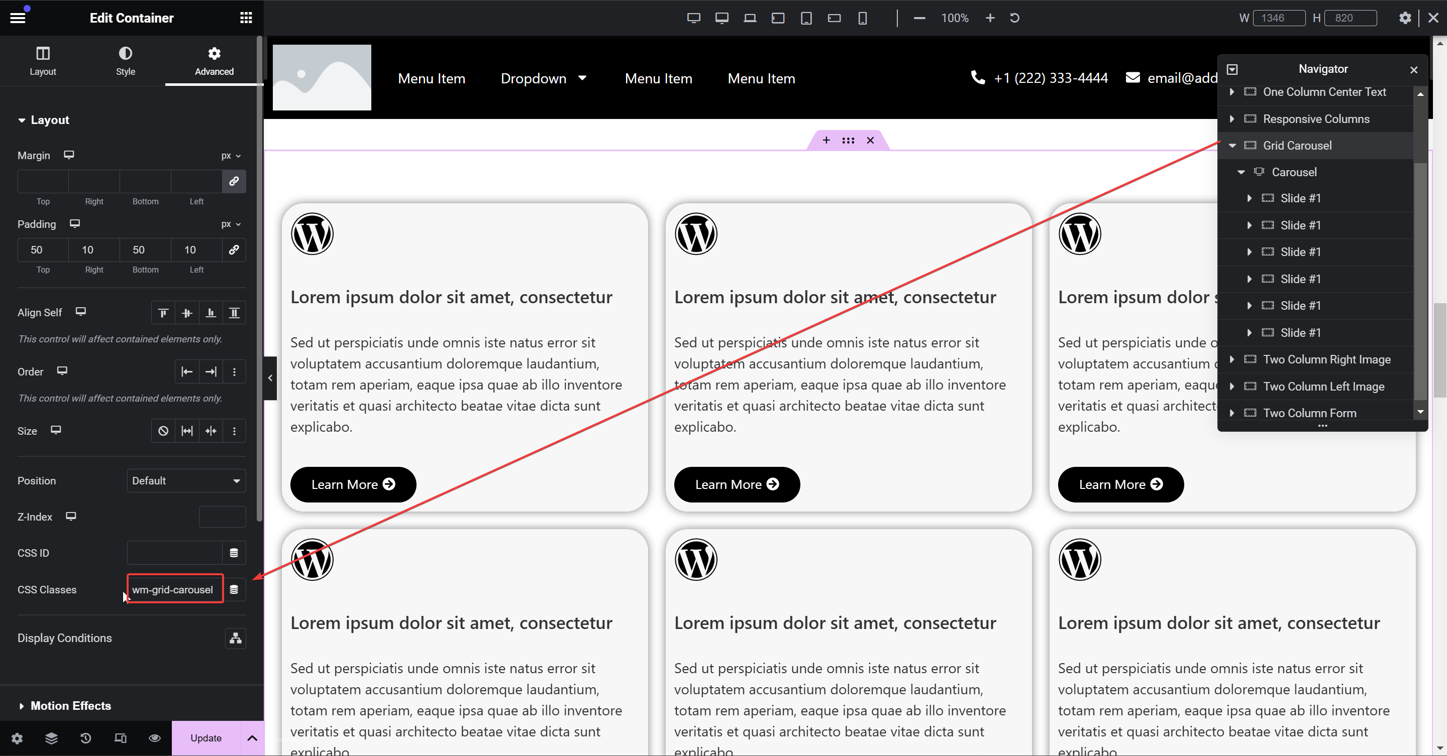
Assuming you have all the right settings set up, and the CSS has been added to a stylesheet, the only thing you need to do is add the class of wm-grid-carousel to the container which holds the carousel widget. From there on, all the styles get applied down to the swiper slides.
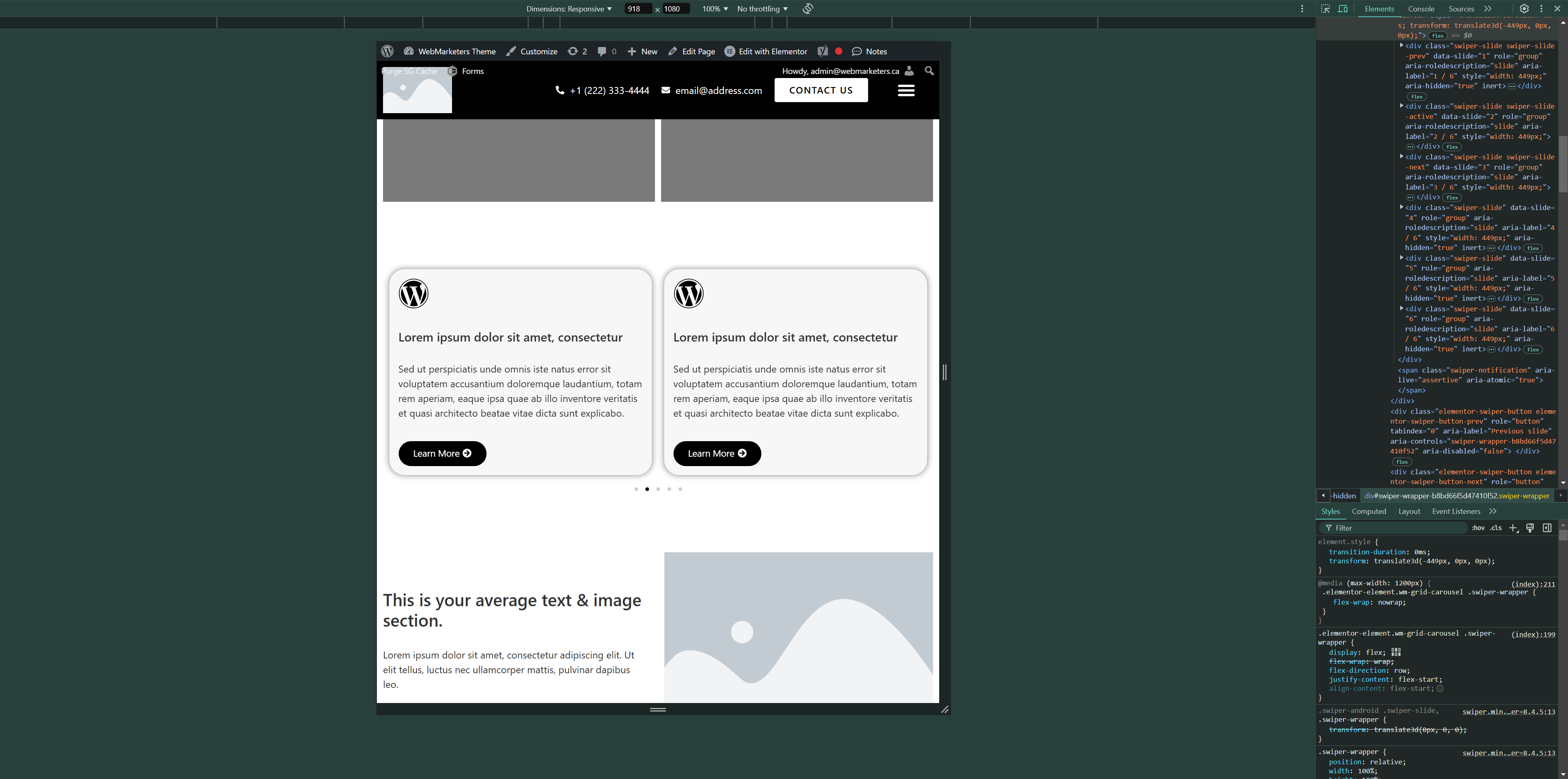
Now just test it on tablet & mobile and see the magic in action! It will automatically adjust the visibility of pagination and arrows based on your styles as soon as the carousel functionality is needed.
Now, there's one important thing to keep in mind. Grid layouts usually use gaps. If you use a gap on your grid's parent container, make sure to disable it at the 1200px breakpoint. If you leave the gap enabled, you will get this inconsistent carousel that doesn't line up, and only gets worse as you progress to the furthest slide.
That's all! If you have any questions, please let me know.